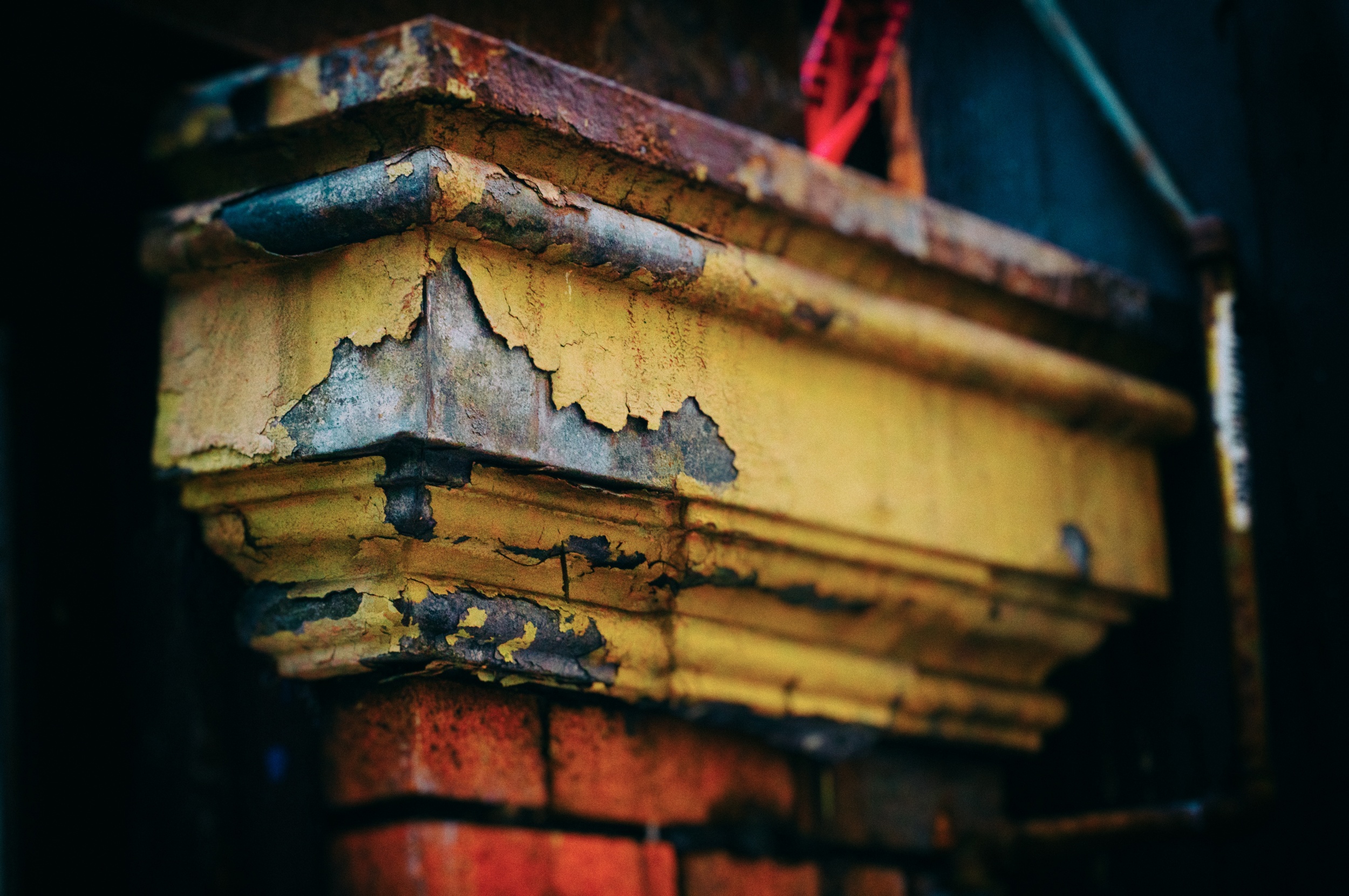
I was crawling around on some scaffolding in Victoria on a Sunday morning to get some images of demolition/construction site. As I was leaving I looked up just before I started to climb down and I saw that I was eye level with a very interesting gutter on the next building. The texture of the chipped yellow paint over the blue tin… lead? of the gutter was really compelling. I snapped off the picture and didn’t pay enough attention to the exposure. The image became a study in texture and colour that I wanted to work on when I got it into my computer. I loved the way that the steel blue, the aging yellow, the orange brick and the umber rust all played together along with the incredible variation in texture that each colour represented. However, there was detail on the left and the right of the image that was very distracting and the red caution ribbon was just too much. I had taken the photo without bothering to notice that my aperture was at f/18, effectively bringing the whole image into focus so with my Nik tools I increased the saturation and texture to emphasize the parts of the image I wanted stronger, added a blur and a vignette (darkening around the edges), to de-emphasize or eliminate the parts of the image that I didn’t want. We have such amazing digital tools available to us that we have the capability to make our mistakes into something worthwhile.
The original image as it came out of the camera lacks punch and focus
-Russell Berg
www.seeingberg.com

