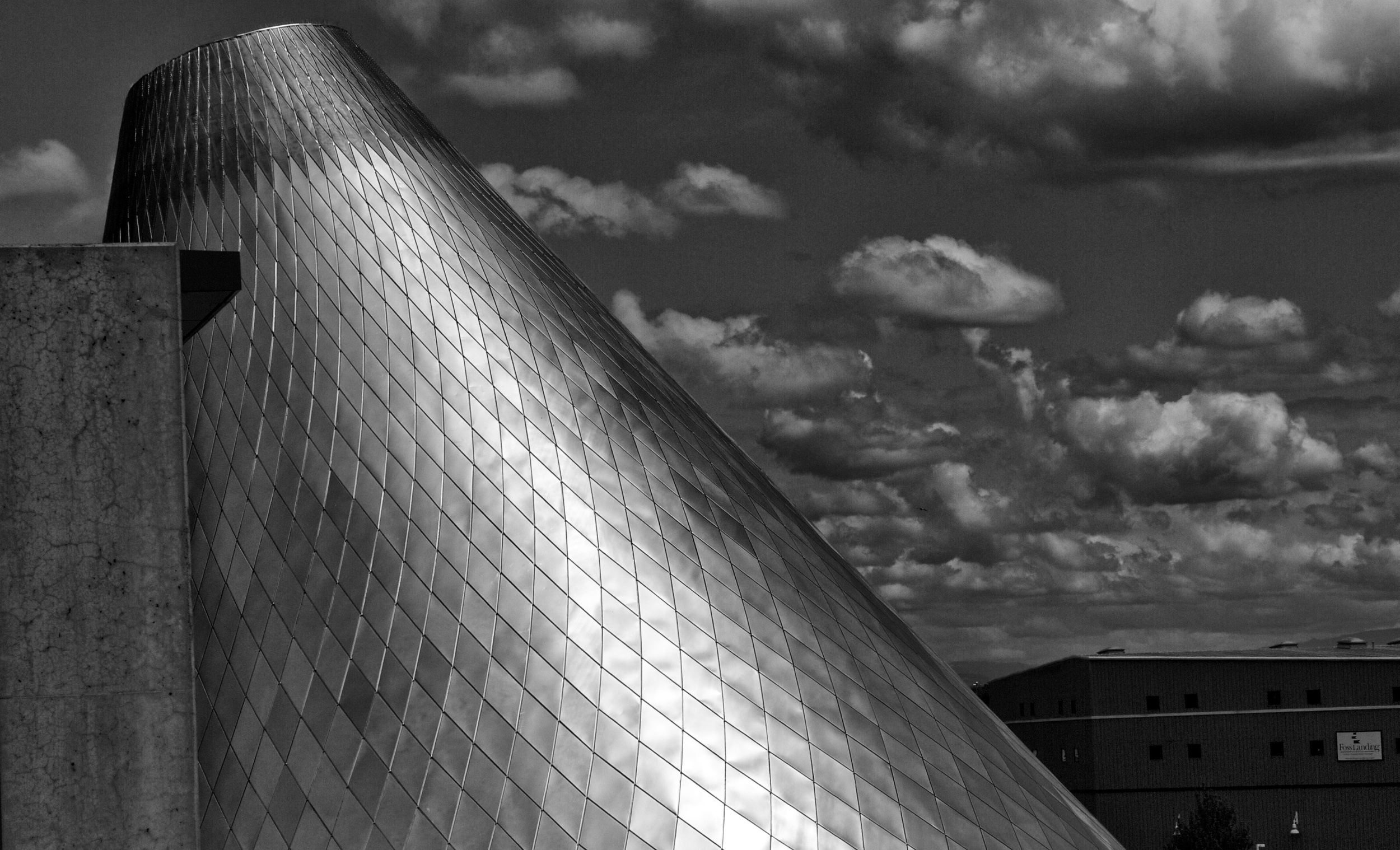
This last image brings the geometry of the cone into focus as well as emphasizing the way that the light plays on on the stainless steel tiles. The other images tend to emphasize the unity of the tiles but here I underexposed the image and increased the contrast and texture to the point where we can see the different ways that the light interacts with the materials on the cone. The lighter centre and the darker edges give the image depth and we get a better sense of it’s shape. The small aperture maintains focus as you look out to the clouds. As you have seen in the last three images I am always looking for ways to increase contrast so I framed the shot to include the concrete wall and I increased the black point until the shape at the top of the wall almost looked like a hole cut into the cone.
-Russell Berg
www.seeingberg.com
